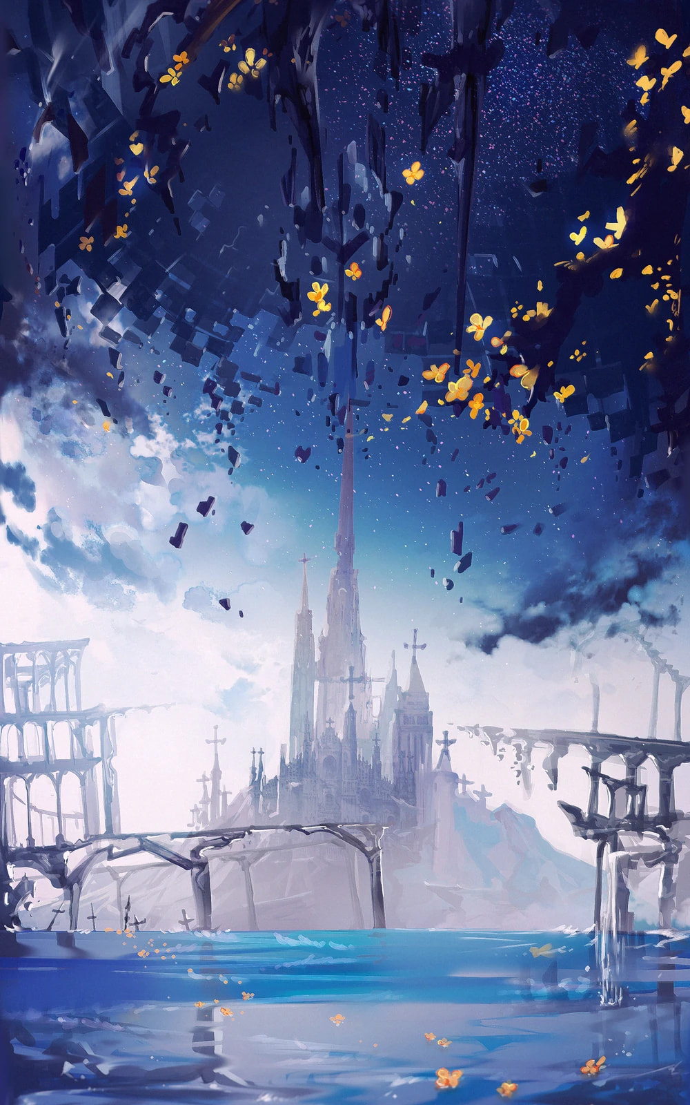
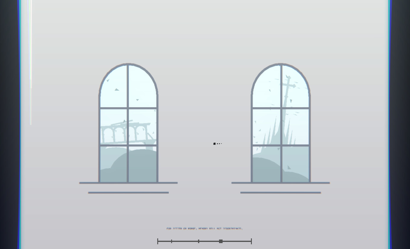
Thousands of fragments drift idly through the sky. Thousands more dart swiftly towards their destinations. Do they have destinations? Why does the glass move at all?
Memory. Between all things, memory does not falter. It’s simple; If it happened, then a memory will capture it. Countless memories, both blessed and damned, are contained in the shards of glass before you. Do you see it? A new memory presents itself. A memory of radiant light; a memory of fickle conflict.
Ask yourself — will you experience this memory once more?
")
Chromastellia
Chromastellia has been a lot of fun to work on, and I’ve learned a lot of new skills in the process! I wasn’t sure if I was going to have enough to talk about for one of these big forum posts, but I was completely wrong. In fact, this is probably way too detailed. Some things were really difficult to create, but I’m extremely proud of how they turned out. I hope I have created a beautiful level that makes you go “woaww…”
Something I’ve noticed is that I used a far greater degree of planning and sketching for this level, and I think it’s helped a lot. I would hate to make something I don’t like and decide to start over, so this is my way of realizing the most basic version to decide if it will work or not.
Not really sure how to talk about this level without first talking about it’s sources of inspiration, so let’s start with that.
Inspiration
This level takes place in the world of Arcaea, a mobile rhythm game. Arcaea has a huge focus on story and atmosphere, which I find super intriguing. Each song represents a memory, and each song’s rhythm game chart is supposed to express the feelings of that memory through its gameplay. In a way, you experience the memories of countless worlds through sound.
The gameplay itself isn’t that important to know for this post, but the most striking things to me are the environments. I can’t exactly find the right words to describe them, but they are absolutely gorgeous to look at…
I fell in love with this world as soon as I began playing, so I wanted a way to create this aesthetic in Afterbeat. It feels so ethereal, mysterious, elegant, graceful, mysterious… good stuff.
Another general inspiration also happens to be an inspiration of Arcaea’s setting itself: artcore. This is a music genre that combines the elegance of orchestral melodies with electronic elements and instruments. Artcore has become a massively popular genre in Japanese rhythm game music. Even a vast majority of Arcaea’s original soundtrack falls somewhere within the realm of artcore.
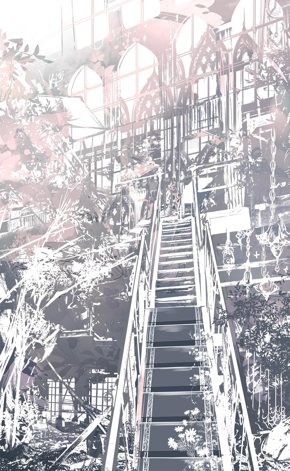
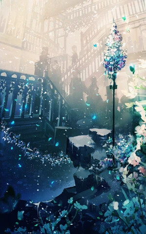
The artists who illustrated the world of Arcaea have created a sort of “visual artcore” that permeates throughout the entire game. I hope the images above can help convey the feelings I’m trying to describe well enough. Clean white surfaces, breathtaking views of ornate architecture and glass, elegant flower petals and detailed inscriptions… the very essence of Arcaea itself is rooted in the concept of artcore.
Song Choice
ak+q is the Japanese artcore artist that creates the sound design and menu music for Arcaea. They have released lots of music outside of Arcaea, but lots of it feels like it would fit right in without any issues. In a way, they have created the very soundscape of Arcaea itself. ak+q’s style is the same thing as Arcaea’s style. They’re synonymous.
Therefore, if I were to capture the essence of Arcaea and artcore alike, it was clear that I had to use a song by ak+q. I took a listen through a few of their albums, eventually making the decision to use Chromastellia for my level. I had thought of using a song that was already in Arcaea, like Vexaria for example, but they seemed a little difficult to translate into an Afterbeat level for some reason. I settled on Chromastellia because of how the intro and drop was handled. It felt just like exploring an unknown world, both beautiful and mysterious. This song seemed like the perfect fit.
Creative Process
So I’m probably gonna do way too much yapping here, but you probably don’t mind if you already read this far, so let’s start!!!
Intro
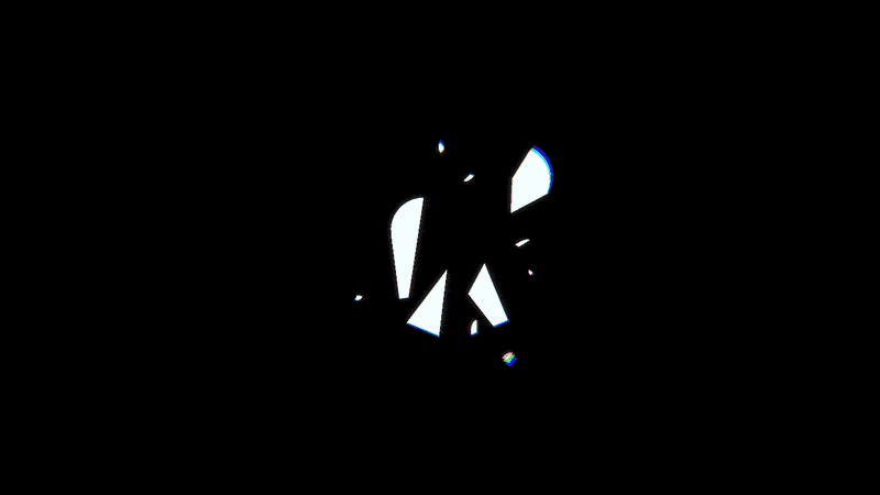
The very opening transition with the camera entering the glass fragment was added much later, but everything else was created largely in one sitting. The mask for the opening transition itself was deceptively difficult to make, so I had to use a lot of weird scaling and movement to make it stay centered to the middle of the screen.
I really liked the metronome faintly beeping in the back of the song, so I created a simple set of abstract squares to represent the sound. I love me my random shapes… The environment was largely inspired by Minterfly’s level, Shattered Glass. It’s a cool level, go check it out if you missed it! The glass fragment designs used here are also derivative of the glass used in Minterfly’s level. I used her glass as a reference to shape and sculpt my own.
Light

Woaaaaaowwhg so pretty.. is what I hope you said when you played this part.
This background was something very new to me because I had never created scrolling parallax backgrounds before. I used 5 different parents to act as the parallax layers which all of the background decorations (except for the fast moving fragments) followed. Each one moved left a little faster than the one before it, creating a sense of depth as you continue to move forward. Well… not really. I used the player force event to constantly push you left so it seems like you’re fighting against the wind. Combine this with speedlines and it gives quite the illusion of a moving scene!
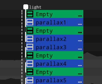
At the end of this part, you dive into the darkness below and move on to the next checkpoint. When you move down, the background objects actually move accordingly to sell the prespective of a 3d environment more realistically. Since they move downward and sideways at the same time, this is why each parallax parent also has an additional empty to drag it downwards.
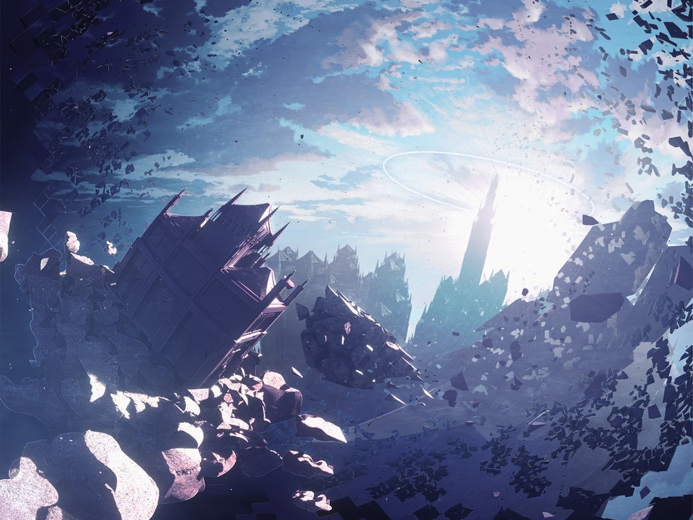
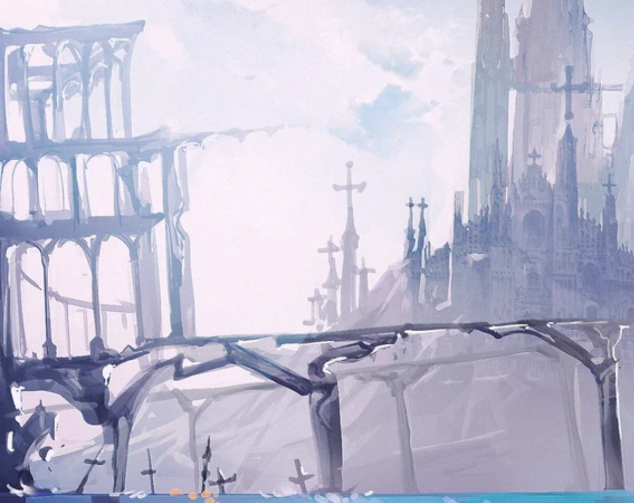
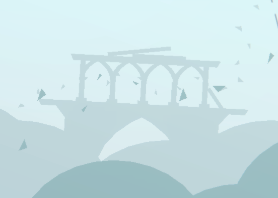
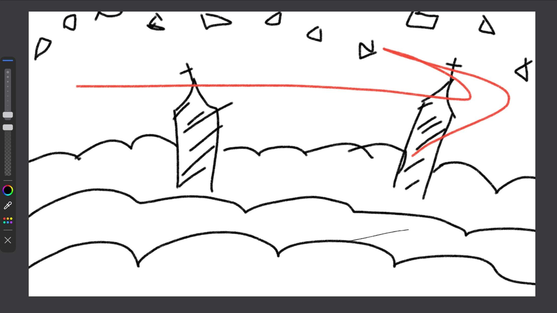
The composition of the scene was vaguely drawn from Arcaea’s story mode map:
The cathedral on the left and the spire on the right were important points of focus when I made the background, so I tried to keep a consistent level of detail without fighting for attention with the foreground attacks. It was important that they were both imposing in their scale, but still obviously harmless during gameplay. And of course, there needed to be glass fragments flying about. Like a lot of them. Like so many fragments you have no idea how much glass I had to move please send help
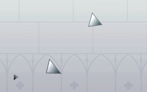
As for the actual attacks, I exaggerated the speed of the fragments by stretching them out as they sped up. I didn’t wanna overdue it and make them seem too elastic or soft, but I think I struck a good balance. The blinking dotted lines are made from a single text object to make them more convenient to work with.
The darker fragments drift by more aimlessly. It’s subtle, but they move at random speeds and even in a random direction vertically. Mostly used to fill in empty space between the light fragments.
It was difficult to find ways to differentiate foreground fragments from the ones in the background, so I made sure the fragments that damage you have outlines or other ways in which they pop out. For instance, none of the background fragments have gradients, but all the foreground fragments do.
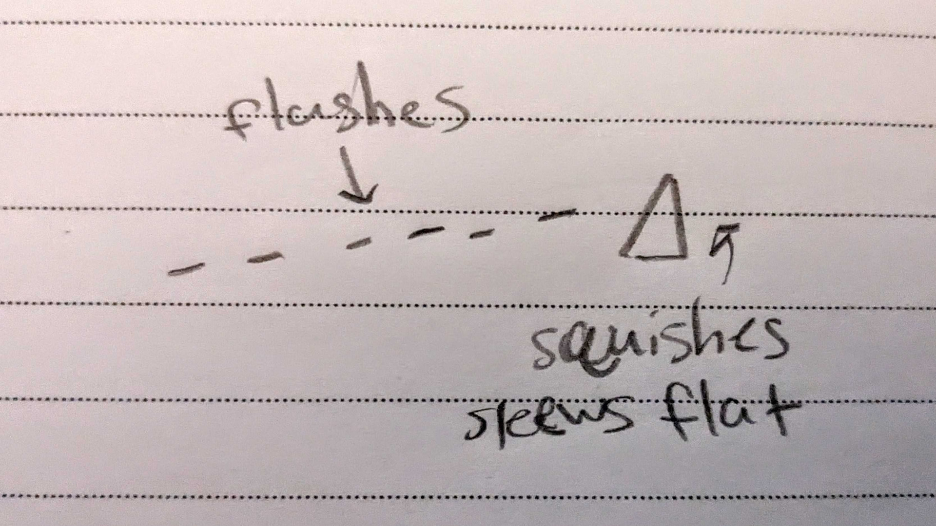
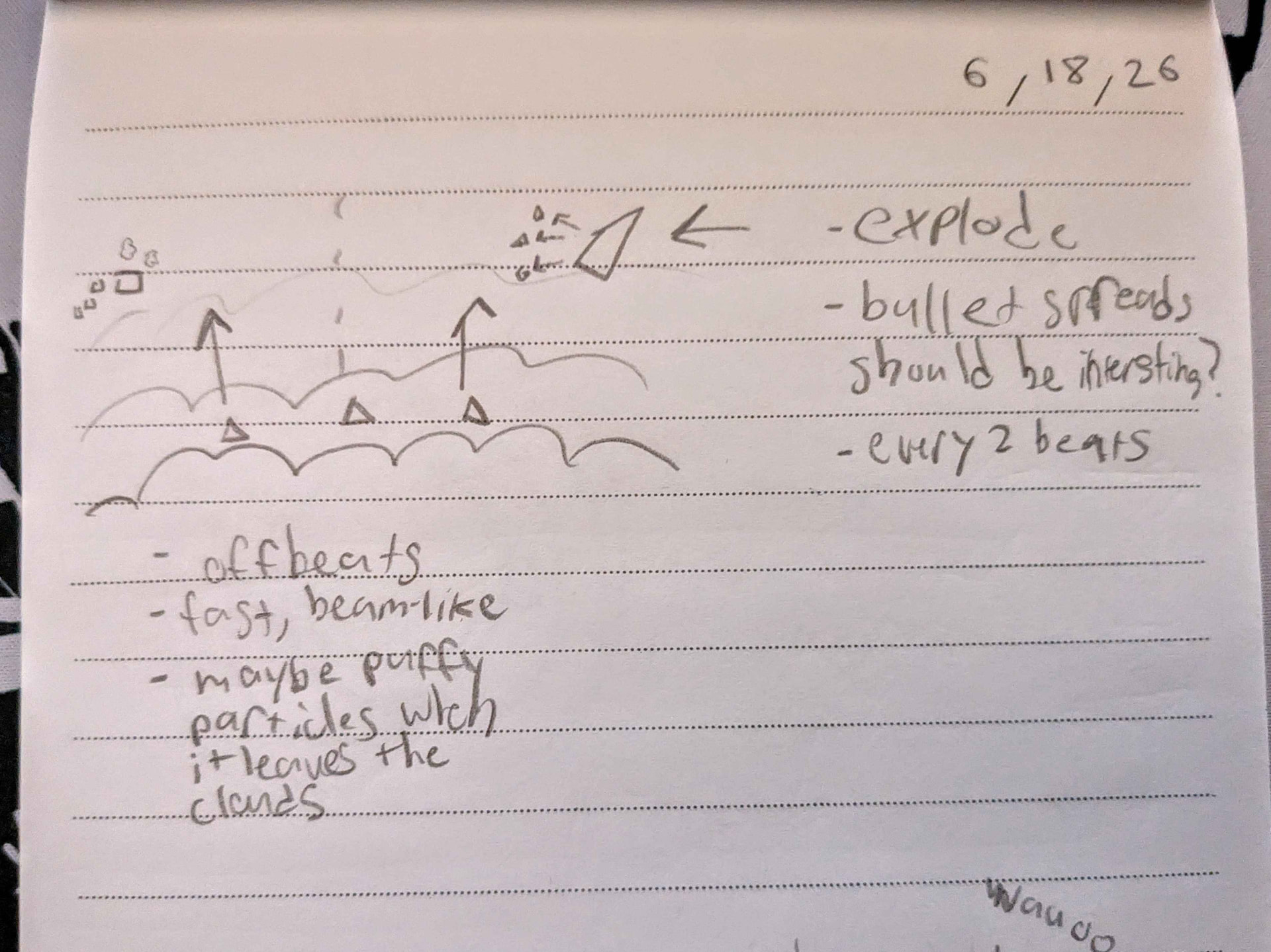
I found an old sketch I jotted down while I was in a hurry, but it came out pretty similar!
The writing you can see near the bottom of the screen in really small font is taken directly from the prologue of Arcaea. It’s mostly meant to serve as aesthetic decoration rather than actually be read honestly. I pretty much just stole the idea from this fan edit of the Aegleseeker music video. (Unfortunately can’t find the video sighhh)
Conflict
There’s not much to say about this part because it’s largely recycled from the intro. However, there are a few subtle differences.
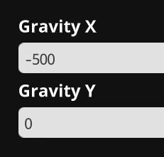
When the player enters this scene, they fall down from above. I used the gravity event again to push them downwards in a more natural way. I also used a lot of little particles to emphasize the downward impact. I really wanted to make sure these particles looked natural so I made them float upwards after a little bit like they’re underwater.
These square sentry things are one of the few attacks I didn’t sketch out beforehand, I kinda just made them on the fly with what ideas I had in mind.
The transition at the end was originally going to involve upward movement as you ascended all the way back up to the clouds, but I felt that having a completely stationary part balanced out the intense movement of the other parts (this is my fancy way of saying I was lazy).
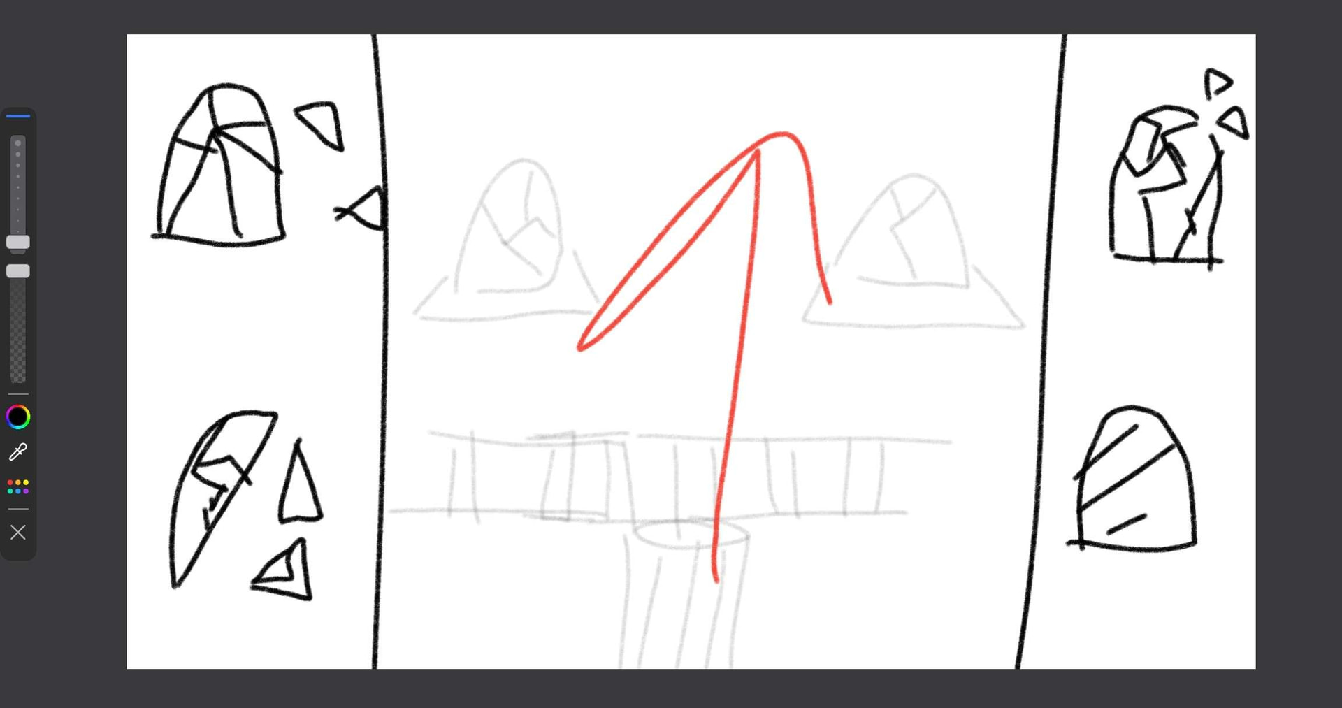
Soaring
The design for the clouds was directly inspired by these clouds from Cave Story. They use solid flat colors, yet they still look very satisfyingly fluffy in a way? Maybe it has to do with the way its layered, no idea. Similar to the first scrolling part, each layer of clouds is attached to a single parent that scrolls to the left at different speeds to give the illusion of depth.
There was a point where I considered using lots of gradients and fancy layers to make the clouds more detailed and foggy, but I quickly settled on this flatter approach. This scene also used to be much more zoomed in, but I adjusted all the positions of the clouds to work with a zoomed out view, making the world seem much grander, and the player seem much smaller.
The ruins you see in the background were partially recreated from these structures you see in this Arcaea background:
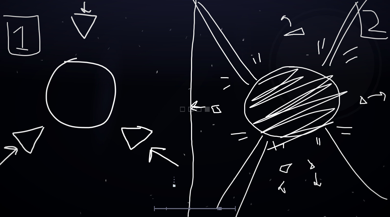
Here’s a concept sketch I made before I started building the environment:
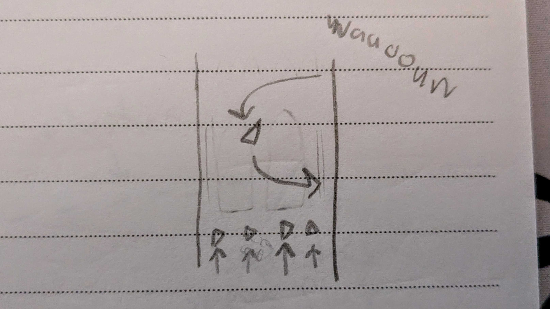
And here’s a sketch I made while brainstorming ways to add attacks to this part. Another rare occurrence of my attack sketches turning out exactly how I initially wrote them down in the final product…
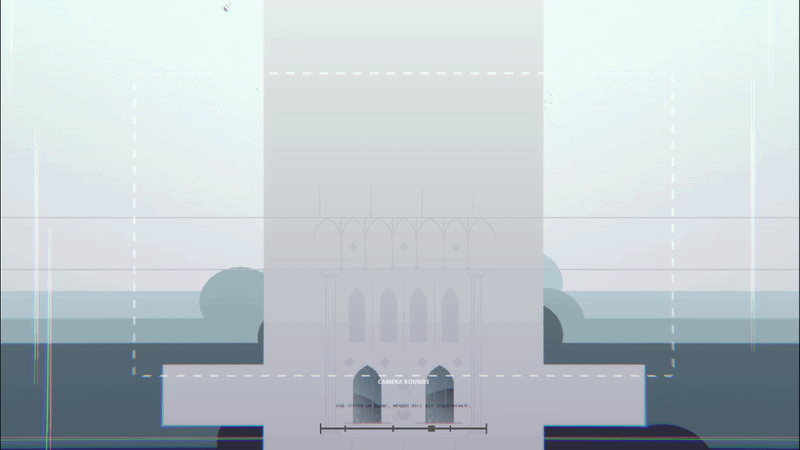
Tower
This was the most difficult part to build, but also the most rewarding. I was really worried about creating an interior that conveys ornate details without being too visually noisy, but I am extremely happy with the end result.
I was pretty lost when I began decorating the inside, so I did lots of research… I did not expect to spend so much time looking at walls.

This video was really helpful in pointing out exactly which important details to include. Obviously I could only go so far with project arrhythmia, but it’s important to understand the details so they could be abstracted down into simpler, clearly recognizable shapes.
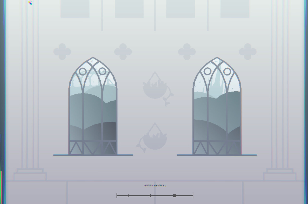
One thing I was especially picky about was the shape of the windows. Traditionally, gothic architecture has pointed arches that aren’t perfectly round at the top. These allow more strength to be directed straight downward, as opposed to pointing outwards to the sides. This in turn allows for larger spaces without needing as much support from walls, creating some really beautiful and striking designs. These walls are designed to allow as much light in as possible with little space in-between windows. Pretty interesting stuff honestly!
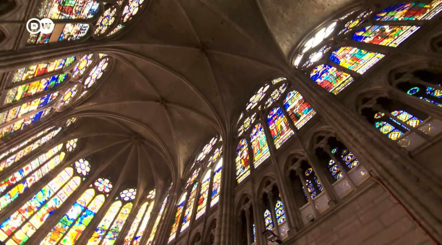
(image from https://youtu.be/4eGWHxbTSO8)
I actually almost left the windows and arches with a basic rounded top, but I went back near the end of the level creation process and redid all of them! I’m much happier with how they look, and I feel like they are really important in conveying the gothic style even when I am limited to using such simplistic visuals. For comparison, here’s a before and after pic of the fancy windows in the tower:
These arches below the windows also used to be rounded. They were a bit haphazardly placed too, so I’m glad I went back to change them.
A very slight gradient effect was used in the end, which gives the flat spaces just a little teeny tiny bit more needed texture. The walls on the side are made of gradients so they have just a little depth, but I also made them light up when a window passed by.
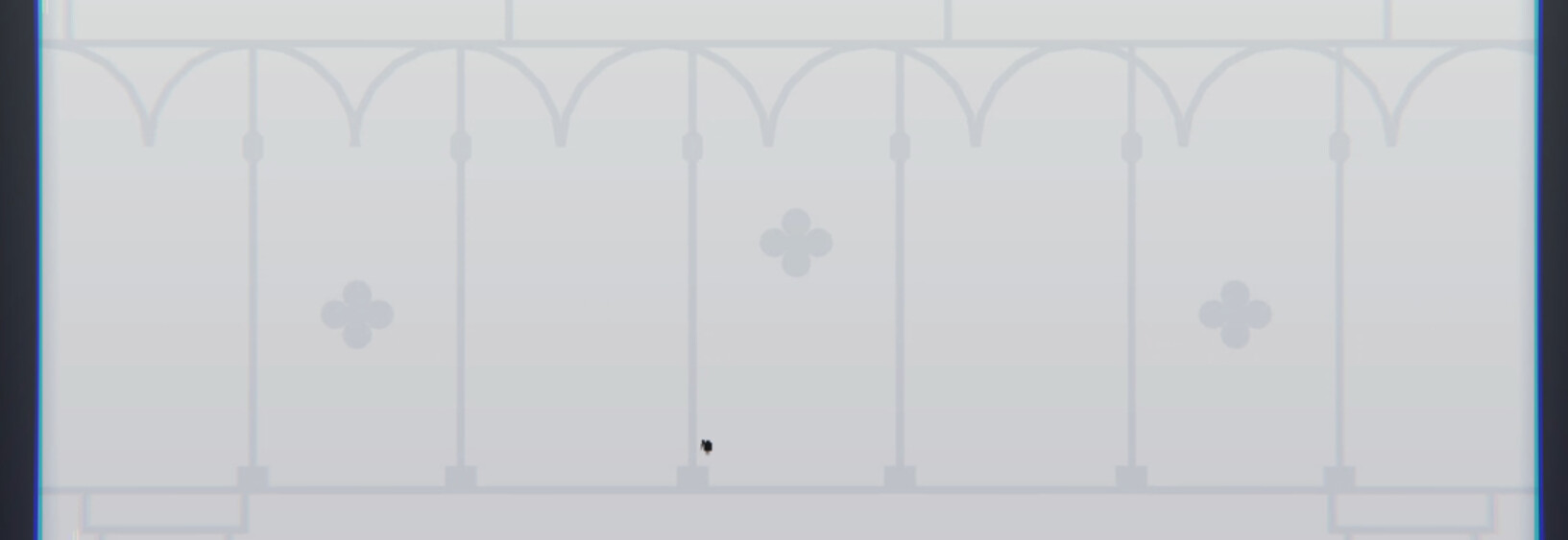
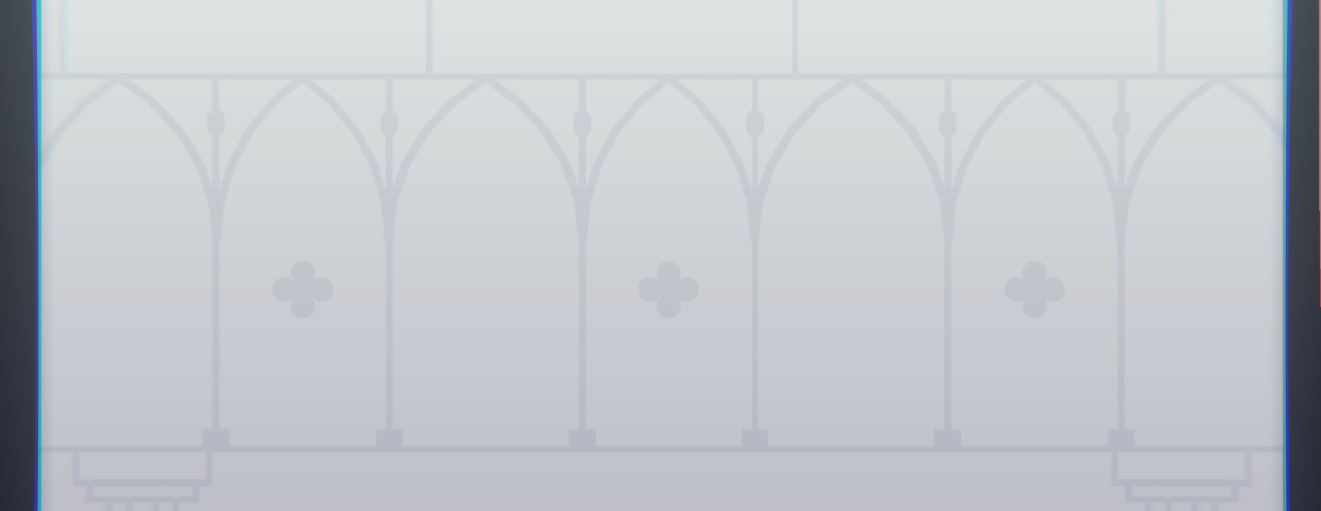
Everything on the wall is attached to a single scrolling object that repeats an upwards movement over and over. I was really worried that it might be too difficult to create something so detailed and still have it loop perfectly, but I was able to find just the right distance before the wall needed to loop seamlessly. The bottom and top of the wall look exactly identical so when it snaps back to the top, you can’t actually tell the difference at all. Here’s what it looks like really zoomed out:
This was also very convenient because I only had to place the objects down once. Since they’re reused, any changes I made would apply to every loop.
Here’s some more rough sketches I made when planning out how this part would look:
Notice how this scene was originally supposed to be an upwards ascent instead of a downwards plummet. I decided on the plummet because it transitioned well into the ending part a lot better, but it also just felt more fitting for that part of the song.
The attacks have a more noticeable difference from the final version.
Originally, the dark fragments would have more uniform patterns from the bottom of the screen, while the light fragments would be more random. They were originally going to swoop in from the sides of the screen, but I wanted to do something more interesting. It also felt a little lazy to re-use the dotted line shard attack for the 3rd time.
Thus, these pairs of spinning fragments were born. It took a little work to get the smear frames looking right, but I asked for some help and used some examples to help me through it. If you slow it down, you can see each fragment slowly form into the smeared semicircle that rotates around the center point. Some sparks were added around the circle to emphasize the rotation, and the circle was made slightly off kilter so it didn’t look too neat.
Ending
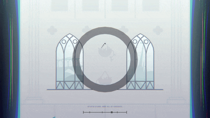
The transition into the ending was a little tricky to make, but I’m really happy with how it looks. The speed lines moving upwards come to a halt and idle in the surrounding area around the shard. The positioning of these idle fragments and circles are actually manually placed so they don’t spawn on top of the large fragment in the center. It was really important to me that it sold the illusion of entering a fragment, just like the very beginning of the level. I also used a lot of movement triggers for all of the transitions to make sure the player is always framed inside the fragment, or to prevent players from losing their nanobot.
Not much to say about these fancy glass bombs, but the fragments were originally going to be perfectly round slices. I made them more chunky because it felt too neat compared to all the other fragments.
Here’s a sketch of these glass bombs I made while brainstorming attack concepts (This time actually in-game. I’m so organized truuust me)
End Title Screen
I thought it would be cool to create a custom end screen like from geometry dash levels and stuff. I did not realize how long it would take. This was a terrible mistake. I spent like 5 hours making these 5 seconds.

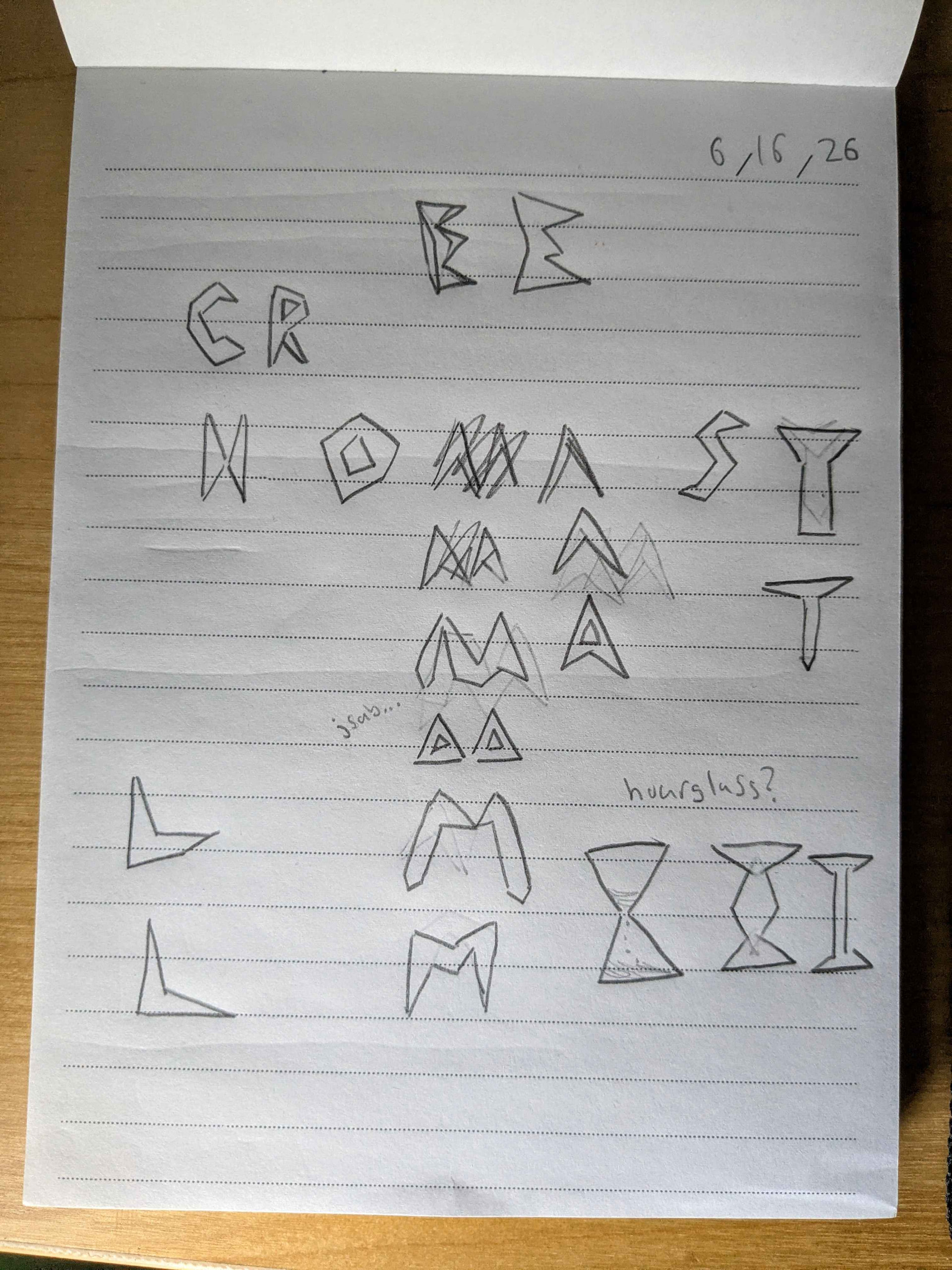
Each letter was constructed from scratch using a variety of triangles to make this custom font. I sketched out what this might look like beforehand, and here are some of the results. I had a lot of trouble with the letter M for some reason…
I also tried to keep in mind the line width for each letter, as it should be roughly the same for all of them. Initially, I was thinking of a thinner font to feel more elegant, graceful, and fragile. However, I also really liked the feeling of this chunky font because it felt like it was made of fragments you’ve seen throughout the level. I think because of this connection to the level, it ended up feeling like the right choice to me.
Closing Thoughts
So, glass, amiright??
Anyways, I’m very glad this concept escaped the mind palace and manifested as a real level. The whole process, including brainstorming, charting, and writing this forum post, took just under 1 month, which is unusually fast for me. I think that can be attributed to my different approach to planning and brainstorming this time. I often jotted things down on actual paper and stuff. Not to mention I’ve gained a lot of plain old experience by now, so I’m able to translate my ideas into the game much easier than past me. In total, I would estimate about 70 hours or so were spent actually in the editor.
My work ethic was a lot stronger this time too, since I forced myself to take breaks. I tried not to work on it for too long each day, but I also tried to get at least 1 thing done every day, no matter how small. The “open editor, stare at level, close editor” curse has been lifted at long last…
Thanks so much for reading, playing, watching, helping, or anything else. It really means the world to me when I receive kind words about my work. Same goes for the people who helped me out here and there! I’m incredibly proud of the things I create, so it makes me incredibly happy when others are able to enjoy them too.
Anyways, I’m going back into hibernation for a billion years until the next strike of inspiration hits me on a random Tuesday. Byebye!